A response to Murray and Helm on Auckland’s upzoning.
Update: 12/02//2025. An updated version of this blog post has been published in a peer-reviewed journal (Land Use Policy). The updated version was co-authored with Stu Donovan. It is open access and can be found here: https://www.sciencedirect.com/science/article/pii/S0264837725000316
I would highly recommend reading that instead of the below, as it is more polished and comprehensive. I wrote the below in ~2 days, so I missed many areas where they made major errors in critiquing the original RGM paper. For instance, until recently I was unaware that Murray and Helm simply lump all omitted data in the treated group, without any regard to whether these data were truly “treated” in any sense of the word.
You can find the original blog post below, unedited, for posterity’s sake, and in case anyone wishes to document the whole episode fully.
###############################################################
################################################################
I’ve written heavily on this blog about Auckland as evidence for how upzoning can increase housing supply and lower rents. To me, the data are very clear on this. I’m going to assume that if you’re reading this you’re also familiar with the effects of Auckland’s upzoning - if you’re not I’d recommend reading this and then coming back here.
One of the unique elements of Auckland as a piece of evidence on upzoning is that we have causal analysis. That is, a 2022 paper from Ryan Greenaway-McGrevy and Phillips showed that the Auckland Unitary Plan (AUP) caused housing supply to increase.
A recent blog post by Cameron Murray and Tim Helm challenges the methodology of this paper boldly claiming that “there is no evidence that upzoning increased construction” and calls it a “myth”. The analysis in the blog post seems to be in good faith and raises some good points. The authors have clearly spent a lot of time understanding the data and the broader context. You should read their post first before reading this response. But ultimately, I do not think that Murray and Helm disprove the paper, and I think they are overly ambitious about how serious their criticisms are. I don’t normally engage with other housing research on here, but given that I’m sure I’ll see their blog post mentioned dozens of times in response to this website, I thought I’d put together a response.
First, some background. As far as I can tell, the story goes something like this. The 2022 Upzoning paper is released. Murray and Helm took issue with some of the methodology of the paper, and so got in contact with the authors. Ryan Greenaway-McGrevy then put out an extension to the paper (the ‘Extension Paper’), dealing with many of the concerns of Murray and Helm. (The blog post itself acknowledges this exchange, but I wasn’t privy to these conversations so I don’t know this for sure.) So far so good.
As far as I can tell, the extension paper deals with almost all of Murray and Helm’s concerns quite well. It shows that the original paper’s findings hold and are robust. If the criticisms from Murray and Helm were the factor that lead the creation of the extension paper I think that is a huge positive for everyone - more robust research is a net good, and the extension paper is well written. For that I commend all parties involved.
The problem is that the blog post is published after the extension paper. Although it acknowledges it, it also hardly engages with the updated research. I don’t quite understand why the blog post is framed in this manner. It’s unclear to me why Murray and Helm continued to focus much of their criticism on the initial paper in their post, when their concerns were largely addressed in the extension paper and shown to be irrelevant to its conclusions. It’s possible they worked hard on their initial criticisms, and wanted to publish them regardless. But, to an uninformed reader, it gives off the false impression that there were glaring issues in the paper’s methodology that have not been addressed. I very much doubt the layperson is going to read all the way through the extension paper and form a complete view of the evidence.
Instead, the blog post should have either:
a) Presented their criticisms, and acknowledged they had been responded to and addressed; Or
b) Not have been published until Murray and Helm had generated a response to the extension paper, and then published their critique in full; Or
c) Acknowledged that this was an ongoing discourse and this was the latest on their criticisms, and that the jury was still out.
Ultimately, I’m not sure if Murray and Helm still have issues with the responses from the extension paper. Clarification would be helpful.
I’ve read both papers multiple times. For simplicity, I’m going to refer to the first paper as GMP (Greenaway-McGrevy & Phillips), and the second one as RGM (as it was just written by Ryan Greenaway-McGrevy) or simply ‘the extension paper’. This post is largely going to be explaining how the extension paper engages with the critiques of the blog post, with some commentary to boot. The extension paper not only makes the upzoning case significantly more robust, but adds new evidence that another policy had an impact on housing supply.
Finally, just some other housekeeping things before we get into it:
I am not the authors of either paper, any errors are my own and don’t have any bearing on their work. If they put out a targeted response it should supersede this post.
I have been in contact, at one point or another, with RGM, Murray, and Helm, and l have had positive experiences with all 3 of them. I’ve also been on Murray’s podcast, which I recommend you checking out, if you haven’t already.
In general, I do appreciate good-faith engagements with the evidence on zoning reform. I’ve had my mind changed, or opinions tempered, on multiple occasions by people with opposing views. So if I’ve got stuff wrong here let me know and I will update this post.
A TL;DR on Greenaway-McGrevy & Phillips 2022.
GMP is a 2022 paper which argues that upzoning caused an increase in housing supply in Auckland. The paper does this by analysing dwelling consents in Auckland’s upzoned areas ('the “treatment area”), in comparison to it’s non-upzoned areas (the “control area”) through a statistical technique called a ‘difference-in-difference’. The paper also does some more complex statistics to control for the fact that some housing supply in upzoned areas was likely what would have happened anyway in the non-upzoned areas without the policy.
The most famous chart from the paper - and one I’ve had on this website for a while now - highlights the significant increase in new supply in the upzoned relative to the non-upzoned areas. This chart is important, as it is key to understanding Murray and Helm’s criticism. They refer to the big spike in consents after 2016 as the ‘structural break’ in consents. We’ll come back to this later.

The paper makes a few other claims - namely that under some assumptions the reforms likely led to around a 4-5% increase in the stock of housing. It also does some sophisticated econometrics to suggest the robustness of their estimated effects; the authors calculate how ‘wrong’ their estimates of the non-upzoning counterfactual would have to be for upzoning to have no effect.
I’d highly recommend having a read of the paper, if you haven’t already. But let’s get into the criticisms of it.
Criticism 1: Data Coverage
The main crux of the blog post is that the GMP paper leaves out some areas of Auckland in its dwelling consents data. Murray and Helm claim that if you include this missing data as part of ‘treatment’ group, you don’t get as nice of a structural break, and it’s less clear that upzoning caused the surge in housing supply units. They present the chart below as evidence.
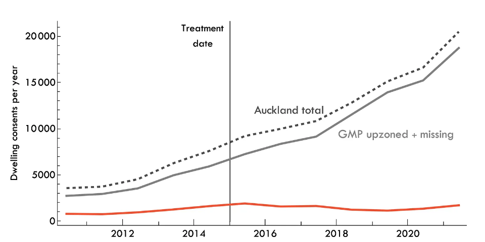
Let’s talk about the missing data. It comes from Special Housing Areas - SpHAs, for short. GMP describes what these are in the original paper:
“These designated areas came with incentives for developers to provide affordable housing by offering accelerated consenting processing, and would be considered an ‘inclusionary zoning’ policy in the United States. The Unitary Plan superseded the development incentives once it came into effect.”
Basically, these were areas where developers could early-access AUP rules, provided they supplied some proportion of affordable housing. They ran from 2013 to the implementation of the AUP in Dec 2016. In the original paper, these areas are dropped from the sample.
Why?
When conducting a difference-in-difference, one of the key econometric assumptions is that we have ‘parallel trends’ trends between treatment and control groups. Essentially, for us to believe that the two groups are comparable they should be moving more-or-less in unison prior to the policy’s implementation. Then, we can assume that after the policy was put into place, any difference in trends between the treatment and control reflect the policy’s impact. It’s like how in drug trials you need the placebo group to have the same level of overall health as the group actually getting the drug in order to assume it’s working and not explained by other factors.
So, basically GMP correctly identifies, econometrically speaking, a threat to their identification technique - that there were areas already undergoing supply reform in Auckland, and so therefore they are not a good fit for the broader ‘trend’ in the area in the absence of upzoning. This results in a bad ‘pre-trend’, and so they remove the contaminated data from their paper. At first glance, I think that’s a fair way to treat the issue - many econometric papers do the exact same thing.
For example, say that we were conducting a study on the effect of an after-school study group (program ‘A’) on the marks of high school students. One approach could be to compare the marks of students the year before the program against the year of the program. But what if over the summer some kids attended summer schooling (Program ‘B’)? That would affect our estimates - we wouldn’t be able to identify what proportion of the change in marks was due to Program A or Program B. So, under some reasonable assumptions, we could drop all students who attended Program B to get better estimates.
This is where the novelty of this approach in the housing literature is unknown territory. Dropping data like this is clearly fair in the education literature, for instance, as it has little spillover effects. But is it fair in housing?
Murray and Helm claim: no it isn’t, because it ignores how construction was trending up in the SpHAs prior to the AUP, so we miss some substitution effect of the policy from already existing construction. I think that’s a fair criticism, and while it probably wouldn’t invalidate the GMP paper, it does raise some doubts about the magnitude of the effects.
In the extension paper RGM re-runs the analysis and includes SpHAs, so now we’re looking at all the data. When he does so, Murray and Helm then point out that this removes his ‘substantial break’ in the series.

In my opinion, it’s always worrying when someone is being ‘quoted’ and the quote cuts off right before a new sentence begins with “however”. Here’s the full quote below.
“Total permits no longer exhibit a substantial break in trend in 2016, when the AUP became operational. However, the decomposition into upzoned and remaining areas illustrates that much of this is due to permits in upzoned areas growing at a faster rate between 2013 and 2016. Thus, much of the increase in the interim period between 2013 and 2016 is occurring in areas targeted for upzoning under the AUP. This accords with developers using the [SpHAs] to get a head start on developing to the relaxed [Land Use Regulations] of the [AUP].”
Basically, the reason why you no longer have this ‘structural break’, is because there was already increased construction due to the SpHAs reforms from 2013 to 2016.
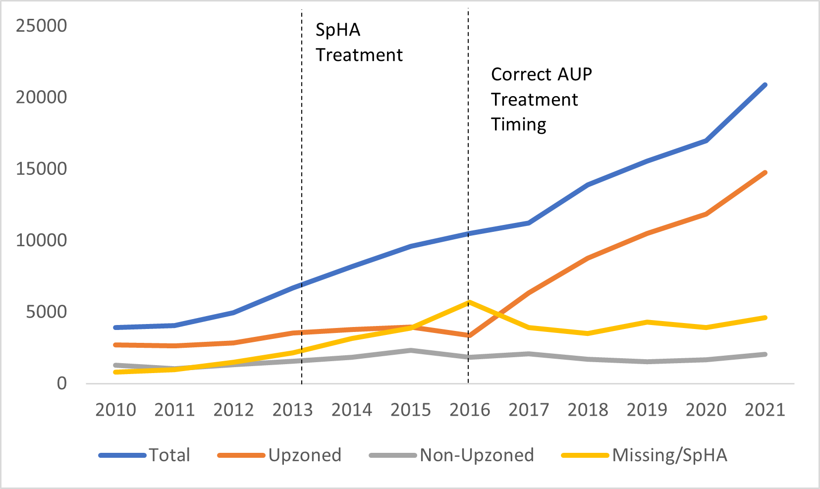
In his extension paper, RGM has dealt with Murray and Helm’s concerns by extending his analysis to include these areas in quite a smart way. Basically, he treats these SpHAs as upzoning #1, and the AUP as upzoning #2. I think this is a nice way of looking at it: when you read SpHA you can think ‘mini upzoning’ and then AUP is ‘full upzoning’.
He then re-runs his analysis with the ‘treatment’ beginning in 2013, rather than 2016. This prevents the violation of the pre-trend assumption. In theory, given that the SpHA reforms were smaller than the AUP reforms, this should push down our estimated impacts of the upzoning. This is a good faith way of getting at the problem; often in econometrics one has to estimate a smaller, lower-bound effect, in order for it to be more robust to criticism.
However, he still finds a large and statistically significant effect. The charts below tell the story, and basically address Murrary and Helm’s concerns, as they factor in their ‘missing data’.

(Also, you can see that the Upzoned and Non-Upzoned Areas are very good counterfactuals/trends for each other).
RGM concludes:
‘The incorporation of the SpHAs generally lends support to the evidence that upzoning increased dwelling construction permits in Auckland. Set-identified treatment effects remain statistically significant under larger counterfactual sets, and point estimates of the increase in permits under linear trend counterfactuals are greater.’
In fact, you can actually see this effect in Murray and Helm’s own charts. When you push the “treatment line” to 2016, and then put in a SpHA treatment line, the chart is compelling of it’s own accord. SpHA’s rise from 2013 to 2016, in line with upzoning #1, then fall once they are superseded by the more powerful AUP. Hey presto, upzoning works.
More conceptually, I don’t understand the internal consistency of the broad claim here from Murray and Helm. Their claim is essentially that the AUP just resulted in substitution from SpHA consents into “Upzoned Consents”. But that argument is tacitly accepting that a form of upzoning was already increasing housing supply, and then the larger scale upzoning crowded it out it. I don’t understand how this is evidence that upzoning overall doesn’t increase supply.
Either:
The SpHA was causing supply to increase, in which case it was violating the pre-trends of the AUP.
Or, it wasn’t, which means you could remove it from the data with no problem.
Either way, upzoning increased housing supply. Overall, the extension of RGM to analyse the SpHA data is useful, because we now have two pieces of evidence that supply reforms work out of Auckland, not just one.
Criticism 2: Linearity assumption
The next criticism in the blog post is that GMP assumes a linear counterfactual trend. Basically, to estimate the effect of upzoning GMP they create a ‘linear trend’ of what construction would have looked like in the absence of the policy.
Murray and Helm contend that the linear trend is not a good fit for the data. They argue that this ‘curved’ counterfactual is better, and when used, reduces the amount of ‘additional’ units that we can claim were built via upzoning.

The blog post claims linearity is inappropriate as few economic phenomenon are actually linear. I think this is a fair criticism, to an extent. I’ve had conversations with economists before where they have expressed concern about the overuse of linear modelling in econometrics. However, that doesn’t mean we should use alternatives arbitrarily. It’s unclear how Murray and Helm have arrived at their ‘curved line’ which they claim is a better fit for the data. From eyeballing, I see no reason as to why it is more appropriate. I could fit any line and claim it’s a “better fit” in order to get however many additional units I wanted. For this criticism to be more robust, they need to explain the econometric rationale behind their use of this specific curved line, and why it is more fair counterfactual. It also loses a benefit of linearity, which is that it removes the potential for overfitting the data.
If they really wanted to criticize the linearity assumption, my recommendation would be to create a non-linear synthetic control based upon comparable urban areas. If they did that, then I would be more sympathetic that their approach is more robust.
Additionally, it seems that a huge chunk of their ‘lost units’ come in 2016, when the AUP was not in place for eleven months of the year. GMP include 2016 in their treatment group to be be conservative with their estimates. They could have started the treatment from 2017, and that would have further increased the impacts of upzoning, as it also likely would have resulted in a lower linear counterfactual trend. Given this already conservative approach, I don’t agree with the blog post playing with assumptions further to make estimates even more conservative.
But even after this, Murray and Helm still find an effect of the policy - at around 4500 units - which still suggests the policy had an impact on housing supply. It’s only when they include the SpHA numbers that the effect disappears/goes negative. But their econometric approach is wrong here, and it is not true to what RGM does. When he includes these data, he pulls the treatment year back to 2013, and then begins the linear trend from there. At the very least, to be internally consistent, Murrary and Helm should model their ‘curved’ line from 2013, not 2016, as well.
Murray and Helm make the mistake below on a chart with a linear trend - they’re modelling the trendline from 2016 onwards when including the SpHA, and then claiming it’s not a good fit. The ‘counterfactual trend’ from 2013-16 is already being affected by the treatment!

I also don’t think their pink line representing the overall trend in the data makes sense. It’s slope should be (roughly) equal to twice the slope of the blue line, not equal to it, as it is meant to represent the counterfactual non-upzoned line, and the counterfactual red upzoned line, to form the overall counterfactual line.
Excuse my incredibly crude drawing below, but I think the linear trend should look something like the following using this data. Notice how this is a much better fit than what the blog post claims. The pink line’s slope is roughly equal to 2 times the blue line, which is estimated from the 2010-13 data. You can see that the black line diverges from the pink line - showing the increase in dwelling supply from the policy, including some supply from 2013-16.

While I have done the above crudely in MS paint, GMP have used sophisticated econometric techniques to estimate their trend lines. Further, the blog post fails to mention how both GMP and RGM do far more than just estimate one linear counterfactual. They calculate multiple counterfactual sets - basically attempting to estimate just how much they would have to be wrong at estimating the trends in order for upzoning to have had no effect on housing supply. They conclude:
“Counterfactual scenarios that imply an approximate four-fold increase in consents over the pre-treatment trend would be needed in order for the estimated treatment effects to become statistically insignificant. There is no concurrent policy change in the narrative record that could plausibly generate such a substantive increase in construction.”
So, even if you don’t buy the linear trend, the paper itself attempts to persuade you just how wrong that linear trend would have to be for upzoning not to have had an impact. And the answer is: a lot. Murray and Helm would do well to engage with these broader counterfactuals in the paper, not just the linear trends.
Criticism 3: Broader impacts of the AUP
The blog post then makes the argument that there may be a loss of utility through the AUP, as the policy has led to urban design choices which are unpopular, or a net negative for Auckland’s urban design.

The evidence provided for this is two pieces in the same online magazine. One of which is an opinion piece ranting about how the outer suburbs of Auckland have had to pick up a greater proportion of the density. The other one appears to be a series of interviews with local residents unhappy with new developments in their backyard (is there a term for such people?). Additionally, there’s some complaints about local transport infrastructure on Greater Auckland. I hardly think this is evidence that the policy has had negative long-run impacts on urban design, or is hated by locals.
As I’ve written before, zoning reform is actually net popular, including in Auckland. I’d put more faith in representative opinion surveys rather than a few articles from NIMBYs online.
Popularity of upzoning in Auckland
Also, the blog post cites an article which misreads the cost benefit analysis of the National Government’s (broader) upzoning reforms. The CBA calculated the benefits of reforms would be about $11,800 per household in added disposable income. However, the article claims that if we just ignore the productivity benefits, then we lose most of this benefit of upzoning. For obvious reasons, I don’t agree with this.
Criticism 4: Completions
The blog post finally touches on the notion of completions versus dwelling consents. Essentially, the argument is that dwelling consents are not the same as dwelling completions - consents do not account for knocking down existing dwellings, and completions and electricity connections (claimed to be reflective of actual new housing stock) are lower than consents. Therefore, measuring consent is problematic.
I’m not going to spend any time on this here, I’ve written about this before, so I would just recommend reading that piece if you’re interested in the data. The TL;DR is that completions are more or less tracking consents, and we will know more as to whether they will hit their peak toward the end of this year.
Some stuff that we could have done without.
Given that I appreciate good-faith analysis even if it disagrees with my priors, it’s always irksome when authors add things that are just provocative or unnecessary. The opening chart of the blog post, is, in my opinion, just bad faith.
The article asks us to identify which of these cities is Auckland, and which one is Wellington. I don’t know why the “Treatment” date is set as 2015 here, as we’re measuring consents across areas and not the AUP within Auckland, and I don’t know what the Y axis is measuring. I can gather that it’s an index of some sort? Index relative to what? What’s the base year?

I strongly dislike the above chart. Here’s what it looks like in 12 month rolling dwelling approvals raw data below. Upzoning #1 from the SpHA’s is the first line, and Upzoning #2 through the AUP is the second line.

Obviously, we do care about percentage changes in variables in some contexts, but a 1% increase in dwelling supply in a larger city is significantly different to a 1% change in dwelling supply in a smaller city. But even if you were comparing percentage changes, here’s what the blog’s chart looks like if you set the base year to 2013. You may disagree with using 2013 as a base year, but the point is that you can make charts look however you want to look if you play around enough with transformations.

I think the blog post would have been more compelling without this section.
Conclusion
Overall, I appreciate Murray and Helm’s attempts to get at the assumptions and methodology of the paper, but I do not think they refute its conclusions. If they want to debunk the effects of Auckland’s upzoning, they should begin by engaging with the extension paper. Additionally, they should explain how they arrive at their non-linear counterfactual, pull back their SpHA trend analysis to 2013 to be at least internally consistent, and engage with the counterfactual sets.
I do agree with the closing sentiment of the blog post though, that supply-side analysis is indeed really difficult. Greenaway-McGrevy appears to be the best right now at giving it a real crack, and so we should treat his papers - and others like it - with the appropriate levels of both support and scrutiny in an emerging literature. On a related note, he has recently released a paper looking at the effect of upzoning on rents in Auckland, finding an enormous effect. I’d highly recommend checking it out.
On a final note, at some point I think Ocam’s Razor must come into play. Essentially, the argument from the anti-upzoning crowd is that Auckland adopted upzoning reform, and during that period, by complete chance or otherwise, multi-unit dwelling consents went through the roof in upzoned areas, while detached consents in non-upzoned areas stayed flat. Consents continued to surge as market fundamentals got worse -construction costs and interest rates increased. Yet this is all a coincidence.
The claim, as far as I can best understand it, is that if upzoning didn’t occur, Auckland would have built roughly the same amount of houses anyway - they just would have been in other locations and at a lower density. This is because all property owners in Auckland are coordinated (knowingly or unknowingly) in restricting supply. To me, this seems implausible.
The blog post tries to claim that Auckland’s construction boom can be explained by a population boom, but Auckland’s population growth was not abnormally high over the 2010s, and has been declining for the past two years, and yet dwelling consents have stayed strong.
Often, the simplest conclusion is often the correct one. In this case, upzoning increased supply.
**** If there is anything I have missed above, please leave a comment below or send me a tweet @1finaleffort.
EDIT 7/06/23: I previously linked to an older version of GMP. I have updated the link and have edited some of the quotes from it accordingly.